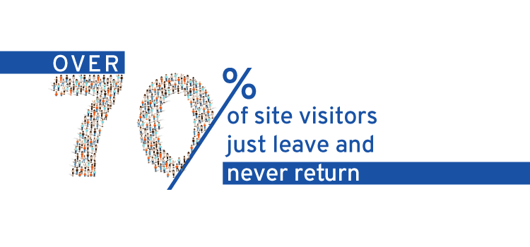
Did you know that seven out of 10 visitors who abandon a site are unlikely to return to the site again? This means that if you are not taking proper measures to buttonhole those visitors, you are losing your shirt!
We believe you do not want that to happen to your business, right?
Let’s take a look at six different ways to convert your abandoning visitors to customers.
Task #1: Offer down-sell with Exit-intent Popup:
Let’s first discuss what down selling is. Down selling is a business technique to offer a more budget-friendly alternative to a product or service initially considered by the customer. This technique is applied when customers show a clear inclination towards refusing to make a purchase. With the down selling technique applied, a business can encourage a customer to reconsider his/her purchase decision as the business is addressing a major ‘objection-price.’
How does the down selling technique work?
Down selling technique helps a business close a sale even when a customer cannot afford to buy a premium product. Take for instance an offer giving $10 off on purchasing four T-shirts. Prospects with more requirements will convert easily. However, prospects with one or two T-shirt requirement might feel that four T-shirts will be way more than they require. Offering a deadline on that $10 discount may not help as well to convert that prospect, because the offer may not a good fit for the prospect with less number of T-shirt requirement.
Here comes the practical use of the down-selling technique with an exit-intent popup. How is that? With the down-sell marketing approach, you can reduce customer’s expectations for a product that still meets their requirements.
Just when a prospect is about to leave the offer page on your site, grab the moment to place a down-sell with an exit-intent popup. It is the best option to stop your prospect from abandoning your site and turn them into customers.
What is an exit-intent popup?
The exit-intent popup is aimed at detecting the precise moment a visitor is about to leave a page and trigger a popup. An exit-intent popup tries to buttonhole visitors with a targeted campaign and to convert them into customers.
How does an exit-intent popup detect the moment of a visitor’s leaving the page?
Exit-intent popup technology can track and follow the movements of visitors’ mouse cursor while they are browsing your site and when those visitors move their mouse option to the exit option, such as a new tab, address bar, or close button, this technology then triggers a popup on your visitors’ screen with a personalized message.
Are exit-intent popups and traditional popups like two peas in a pod?
Unlike traditional popups, exit-intent popups don’t annoy or interrupt visitors during their journey across a site. Exit-intent popups trigger only while prospects are about to leave a page. The goal is to capture visitor attention, create more sales potential and work as a lead magnet incentivizing potential buyers in exchange for their contact details. Exit-intent popups also aim to address the needs and concerns of visitors, unlike traditional popups that irritatingly prompt visitors to perform said action.
How do exit-intent popups work?
Exit-intent popup keeps tracking the buyer’s journey on a site and places offer the moment a prospect is leaving a page. This way, businesses create a lead magnet that your visitors might love to consume. By mapping the buyer’s journey properly, a business can convert even more visitors into customers with exit-intent popups capturing the attention of abandoning visitors the moment they are about to leave its business page. An exit-intent popup then invites them to finish their purchase or to subscribe to an offer, which may be even “Download an eBook,” etc.
Task #2: Implement Live Chat:
Today, live chat is a great tool to convert prospects into customers. There are live chat, voice contact, and social channels, among which live chat stands out for being able to redefine person-to-person contact service. That’s why businesses are leveraging the live chat solution to offer an improved service to their customers and increase conversion.
The adoption of live chat solution is welcomed both by companies and consumers. Why? It is because consumers love this channel of communication, as they get their questions answered almost instantly, without having to wait long for a reply. Companies have definite benefits from this communication channel as it is simple, fast and cost-effective.
How does live chat service benefit a business?
Live chat is an excellent tool to convert visitors to customers. It allows you to chip in a solo journey of a visitor on a site page saying “What are you looking for/ How may I help you?” before any undecided visitor who might have abandoned their purchase had you not chipped in via a live chat window.
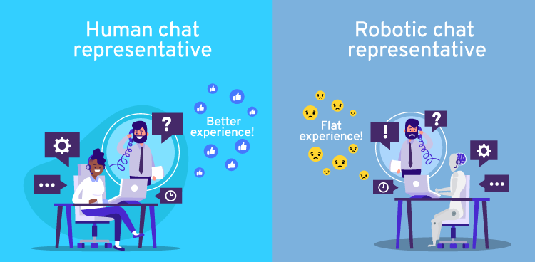
Whether it is automated or manual, live chat plays a crucial role in conversion. However, human greetings and responses are much better than robotic greetings and responses. Studies point out that robotic communication often kills the effectiveness of a live chat, as well as the prospect of a conversion. When mixed with human warmth, a live chat can work wonderfully. Plus, live chat is a really useful way to display your magnetic personality, which is a huge benefit for building a brand.
What is the key function of the Live Chat?
The key function of live chat involves page tracking, which helps in promoting “triggers” and begins the conversation with a prospect/customer when their activity signals site visitors are facing a kind of issue or a purchase issue. Here one thing that must be mentioned is that the page tracking method by even automated live chat tool isn’t foolproof nor is able to read minds. But, human chat, on the other hand, can read minds properly and address solutions to visitors’ issues.
How to use Live Chat?
For businesses, effective use of live chat calls for proper training. Live chat representatives should be knowledgeable about a business inventory and website navigation. They should undergo a training for soft skills. Cheatsheet or FAQs need to be provided to them to improve their performance. Training for answering visitors’/customers’ questions properly and quickly is also essential for them, which in turn drives down chat time! Train your live chat representatives when and how to request customers/visitors to “like” your, for example, Facebook page, which will boost your social weight as well.
Task #3: Make your landing page simple
Best practices of creating landing page will never die down. A simple and uncluttered landing page had been popular, is popular, and will remain popular, because such a page can make it easy for visitors to understand a business offer and find a call-to-action (CTA) button easily. A complex and cluttered page, on the other hand, carries a high chance of confusing its visitors rather than being able to convince them to convert.
Pro Tips for Landing Page:
- Create a clean and appealing UI
- Less is more – use white space, simple copy, and shorter forms
- Remove main navigation and all distracting backlinks
- Include social sharing buttons
- Try A/B testing to see CVR (conversion rate), positioning of offers, kinds of CTA, color scheme, etc.
- Try a contrast color scheme for Call-to-Action (CTA) button
In simple words, a landing page has to be simple and clearly explain its offer in single sentence. Make it easy for understanding the page offer for visitors and even easier to take action.
Task #4: Get an effective copy on the landing page
Even if you have a few words on your landing page, you need to have an effective copy for higher chances of conversion. Visitors must be able to understand your page offer easily and clearly. No ambiguity there! Easy understanding is the USP for an effective copy on the landing page. Make sure that copy is compelling enough to convince people to take action.
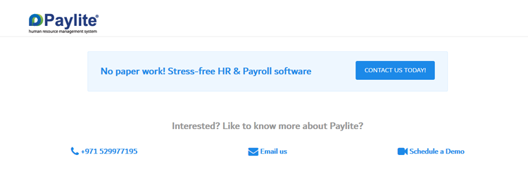
This above copy explains the basic benefit of Paylite® HR Software tersely. The bold texts and icons make it easy for a visitor to skim through the page and still get the message, in a fraction of a second! Visitors can decide whether they should contact Paylite® HR Software via phone call or mail or they should schedule a digital meeting for a product demonstration.
Task #5: Understand visitors’ needs
Is your web page design perfect? Very difficult to say it, because no single page design can be perfect for all businesses. The reason is the business needs tend to vary from one business vertical to another. Depending on those varying needs, design of a landing page has to be planned. In order to do it, you have to understand what potential leads want to see on the landing page to convert.
For example, look at this AddonWorks landing page.
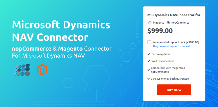
This is a page for those who are looking for an eCommerce plugin to manage all business data in a single place and automate order and customer information, among others. As you already know, most online businesses must look for a solution that can save them valuable time and money. Therefore, it makes sense that AddonWorks provides this solution through this eCommerce plugin, Product Information Management (PIM) tool, for Microsoft® Dynamics to automate customer information sync between nopCommerce/Magento and MS Dynamics NAV System. It also helps in managing inventory while selling products across multiple channels and centralizing inventory.
Task #6: Use Visuals
Though it’s a much-used saying, we would still like to repeat it – ‘a picture is worth a thousand words.’ This can be a case on your landing page too, because images and videos can capture people’s attention more engagingly and can encourage them to take action. Visuals on the landing page can deliver a message or, at the very least, work as a support to your page copy.
This is what AddonWorks has done with its landing page.
The page talks about a solution for nopCommerce version, license type, and price. Visitors can choose options between “Add to Cart” for immediate purchase and “Add to Wishlist” for purchasing it later. A great idea as it puts an image of the solution for an easy understanding of the visitors and helping them to make a choice by just clicking on CTA to get the offer.
The above page talks about the use of a client-side lightbox checkout library that allows for zip money payment. To avail of this service, you have to create an account by clicking on the button ‘Create Account.’ See the details here.
The bottom line:
When it comes to targeting visitors to convert them to customers, there are many more ways to implement them. Those ways when implemented properly and strategically can drive growth exponentially. Are you implementing any other growth hacks to convert abandoning visitors to customers? Let us know what those hacks are and the results you get by leaving a comment below.
Talk to our growth marketers by scheduling a meeting at your convenient time.

